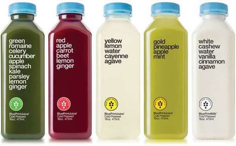
How a Simple Packaging Design Can Catch Eyes in a Cluttered Market
 The 21st century marketplace is packed with so many goods that it can sometimes be difficult for a consumer to know which is right for them and that’s where having the proper kind of packaging can come in to help guide confused customers. A simple packaging design is a breathe of fresh air amongst other, more complex products that look to create something of a concept than an actual good for purchase. As such, keeping a simple packaging design can help identify with customers that are looking for something and don’t want to weed through unnecessary items to get to it. Moreover, a simple packaging design can stand as a beacon in a crowded aisle where attention grabbing is the main tactic.
We’re seeing a distinct shift away from complex designs to simplicity market-wide in everything from packaging itself to branding. Take for instance the recent Wendy’s rebranding, which scales the iconic logo down to a simple image and no-nonsense text; it identifies with consumers on a nostalgic basis because many Americans know where the restaurants are, frequent them for reliable food and service, and will find a new design more in-line with current design aesthetics.
Moving forward onto packaging specifically, Trend Hunter’s PRO Trend Branded Obvious touches on the heart of this discussion surrounding product design and packaging. Manufacturers are taking a more holistic approach and “cutting the fat,” if you will, with regard to everything from packaging to products themselves. It’s this approach of removing labels, traditional boxes and the like that’s grabbing attention and holding it for just long enough to intrigue the buyer.
Simple packaging does – as do all tactics – have it’s downsides. Some consumers might find the lack of logos and conventional containers a bit confusing, but this in itself helps bolster a revolution in the store aisle. While other products might be overlooked because of a loud, colorful and attention-grabbing package that’s like some others in it’s ranking, a simple packaging design is different, intriguing and gets a different kind of attention that might just garner some new customers along the way.
For more information, check out Trend Hunter’s Branding Trend Report for other examples of how the market is shifting on a consistent basis.
References: trendreports


